Wednesday, May 01, 2019
Thursday, May 12, 2016
Transfer
Transfer was one of my favorites in that I found a new way to make my images, that I can print it out and use xerox ink on the paper. But the let down in this process is using the concentrate of winter green, a very strong, burning, christmas smell. Applying winter green to the xerox, you could either print through the press or use an object like a spoon or door knob to create a sense of mark making. The winter green is dangerous and should be used with caution near your skin, and on plexi, as it burns the surface and make it foggy.
A secondary transfer that I did not do personally was to use magazine clay paper and mod podge. You would apply the mod podge on to the surface of the image you want, apply that down on to the paper and wait to dry. When dry we can use water to rub off the clay paper, and ink should remain on the paper. The dangers of this may be damage to the paper or the paper won't always come off.
Subtractive and Additive
Subtractive and additive is probably the most painterly printmaking form available in which a person applies ink onto plexi, to be printed on to paper. In subtractive, a large area of ink is rolled out, and you create your image by removing the ink. In additive, its like painting in which you apply ink onto the plate to make your image. Setswell is something you can add to the ink to make it easier to manipulate and print. Things to note when making your image would be that thick areas of ink will bleed, and be pull down your image, and the time it takes for you to make your image and to print it is drying time, the longer it sits on the plexi, more will dry and not come off.
Non-Press
Non-press is probably the most straight forward "printing" process in which you place a paper on rolled out ink and draw your image from the back. This process allows ease of tracing, or doing quick marks. Things to keep in mind would be the thickness of the papers changes how the line will appear, such as thinner paper allows a more crisp line, while a thicker paper has thick fuzzy lines that come out. Another thought to consider is how thick the ink is rolled out, thin layers come out lighter then drawing on thick ink, but thin layers of ink create less noise, while thick ink creates a lot of noise from the pressure of gravity. While speaking of noise, just be careful to not put your hand or other pressure on the paper, because it will show up.
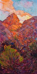
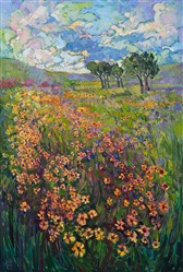
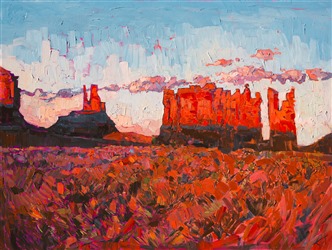
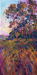
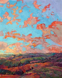
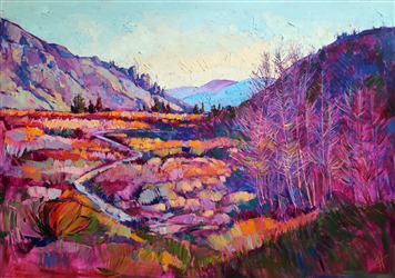
Artist Erin Hanson
Erin Hanson
I like Hanson's work, as I find it similar to my work in the way of her mark making, except hers appears to be more thick then mine, a fault with using the printing press to make a painterly print. I also feel a sense of layering, partly from the thickness of the paint. I like her compositions, and may use the layouts in the future. I also like how some areas have a lot of detail, than others would be broad marks, and somewhat a flat color, I attempt to do this but I can go further with having more or less in my work.
I like Hanson's work, as I find it similar to my work in the way of her mark making, except hers appears to be more thick then mine, a fault with using the printing press to make a painterly print. I also feel a sense of layering, partly from the thickness of the paint. I like her compositions, and may use the layouts in the future. I also like how some areas have a lot of detail, than others would be broad marks, and somewhat a flat color, I attempt to do this but I can go further with having more or less in my work.
Artist Sigmar Polke
Sigmar Polke
I like Polke's work, even though we don't match in themes per say, he uses aspects I like. Looking at some of his landscape work, I find some to be more realistic than others, others putting objects next to each other, a lot of empty space with foreground imagery, which I see in some of my work. I enjoy his comic work very much too, as I am fan, while he takes imagery, I loosely use dots as my connection to comics. Another thing I find interesting is his mix of mark making and styles, like should a figure resemble a comic or be more realistic, and I do want to strive for that in my later works.


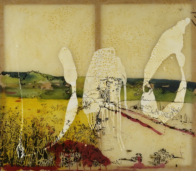


I like Polke's work, even though we don't match in themes per say, he uses aspects I like. Looking at some of his landscape work, I find some to be more realistic than others, others putting objects next to each other, a lot of empty space with foreground imagery, which I see in some of my work. I enjoy his comic work very much too, as I am fan, while he takes imagery, I loosely use dots as my connection to comics. Another thing I find interesting is his mix of mark making and styles, like should a figure resemble a comic or be more realistic, and I do want to strive for that in my later works.
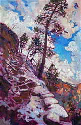
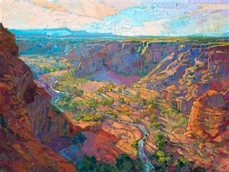
Artist David Hockney
David's Landscapes remind me of my own landscapes that I create, in which they are colorful and strange. I really like how he messes up the perspective of the land, so it appears vertical, to be more easily seen, while I tend to have a low horizon line to see everything straight on. I like the bright color choices he had made, as I am improving upon my use of colors in my series. His landscapes don't necessarily look real, though made from real places, which differs from my made up landscapes, putting random architecture in strange environments.


Art Lecture: Ruth Direktor
Art in Israel between Modernism and Zionism, and in the light of What Come Before and After Along the Tal Aviv Shore
This lecture was a long one, slightly interesting, but would have been better overall if she had picked out the important information, and talked less about each piece because she never got to finish, and speed through the ending. There was interesting pieces she had talked about like such as Gal Weinstein's Red Roof installations and Jezreel Valley. I overall enjoyed looking at the Israeli paintings over the photos and videos, which I find more interesting in colors and purpose, like never drawing the sea at a beach house. I also learned a little about Zionism, and going out to new places. The show itself was also very nice and interesting, the amount of photography and video work had surprised me, and kinda wished I saw more paintings.
Art Lecture: DJ Spooky
DJ Spooky
Paul D. Miller
He had an interesting lecture, that was a mix of him talking about his work and performing his work. His work is taken from his environment, going up to Alaska to study the snow, and create music from the snow. He has interesting books, one about his trip to Alaska, which he created an equation to translate the patterns in the snow into music, another book was about imaginary apps, as he had asked a bunch of artists to create a fake app, but to only make the icon, so as a viewer would guess what the app was about, and more. The performance I had enjoyed too, bringing in 4 students to play strings, after sending his composition ahead of time for them to learn, while he mixes his music along side of there performance was interesting.
Wednesday, May 11, 2016
Screen Monoprints
Screen Monoprints is a technique using a silkscreen to transfer images onto paper. The medium suggest to use is a water soluble medium, such as watercolors, markers, pastels, as long as nothing hardens inside the screen, thus destroying it. Thinker mediums such as watercolor crayons can be used, but if not careful and applied to think, the mark will not transfer. The image that is to be transferred must be created on the screen, with or with out a matrix on it. The printing process itself is the same, nut using a transparency base, to act as water, and activate the pigment as the image is pulled through, how many pulls affects how the final image comes out, less seems light with a lot of white space, while more gets the pigment through, it also blends more.
Exhibit: Paperwork
Jordan Faye Contemporary
"Paperwork"
Featuring artists such as
Ellen Mueller "Monotonize Series"
Megan Hildebrandt "How many days until something is a Habit" series
Lauren Alyssa Howard
Christine Sajecki "August Drawing 1"
The exhibit was interesting to see, mostly because it was a passing visit, not so much to see the work. The first thing you see is a darkened room playing a projected video on the wall, the Monotonize Series, which is what I enjoyed the most, to see a working lady, dressed and doing literal paperwork in nature. Another piece I thought was interesting was the Habit, because it was simply a painted large piece of paper with holes cut into the space, allowing the paper to bend and form depth. Simply most of the work on display were made with paper or about it.
Exhibit: Renwick Gallery
The Renwick Gallery
"Wonder"
Jennifer Angus "In the Midnight Garden"
Chakaia Booker "ANONYMOUS DONOR"
Gabriel Dawe "Plexus A1"
Tara Donovan "Untitled"
Patrick Dougherty "Shindig"
Janet Echelman "1.8"
John Grade "Middle Fork"
Maya Lin "Folding the Chesapeake"
Leo Villareal "Volume"
I enjoyed seeing massive installations that overtook the room and the people in it, because I don't get to see it often. I enjoyed seeing the work that went into making things such as, Shindig and Middle Fork, carving or bending wood as they did, and that large, takes time. I was most excited to see In the Midnight Garden because I thought it entertaining to use real bugs to create a detailed pattern on the walls, and to even use the blood to make the pink wall color. The trip itself could have been more enjoyable if it were not for the line we had to follow. If I had to choose my favorite and my least, it would respectively be Shindig and Folding the Chesapeake. Shindig I enjoyed because I could go and interact with the piece, and go inside of them, while Chesapeake and me left for needing more of the exhibit, it didn't catch my awe as the others in the exhibit had.
Tuesday, February 16, 2016
My work and similar work
5 images I was proud of last semester


Katherine Jones
I like to say her work is similar to mine, despite her work is much more colorful then mine. I see she uses repeated imagery in her work in a more abstracted way.
Seeing Jones work, I would like to create a more cohesive body of work, in style or color pallets, as she favors gold and blue.
 |
| Wash House |
 |
| High Light Bell |
 |
| The Mountain |
Monday, February 15, 2016


Subscribe to:
Posts (Atom)