The things that I use to help me print is the narrative I have made for the imagery I use. Most of my imagery has a lot of line, so most look more drawn over painterly.
When i need to draw a new object, and I want it to look a certain way, I will use reference photos to make it accurate to the real object and to my desired look. And because much of my work use repeated objects and scenes, most works come from my imagination.
If I go into colors, I prefer to use the color wheel combinations, the analogous, monochrome, and complementary. If not i would use colors usually associated with each other, such as green and blue, or transitions of color, a rainbow roll.
Friday, February 12, 2016

Wednesday, February 10, 2016
Body of Work Proposal for Painterly Printmaking
The body of work I want to make in class are landscapes, specific to a narrative I have created. Many of the landscapes can be described as abandoned and empty, as the scenes come from a post-apocalyptic world. Mixing a traditional genre of art, with a more contemporary theme.I plan to achieve the imagery through multiple layers, to achieve depth and variety of mark making. The images will mostly be monochrome with a splash of color, while mixing mark making, drawing and painterly.My goals for this body of work is to further build and discover my narrative by visualizing the world in which my story takes place. Also personally build a portfolio.
Tuesday, November 24, 2015
E. H. Shepard

I like the little slice of life scenes of Christopher, which seem very normal if it wasn't for the Pooh and his friends sitting around with him. I also like how subtle the watercolor is, versus how I feel the characters stand out more, not as soft as the background. I do feel they seem faded as well, but not sure if it is because they are older or made that way.
I would like to create a full scene, much like the Braces below, because most of my backgrounds are broad and empty in my opinion avoiding too much detail that could be distracting, to the image, but to contrast it with soft versus hard lines would be an interesting experiment.
 |
| Christopher Robin's Braces, 1928 |
 |
| Christopher Robin at the Enchanted Place, 1928 |
 |
| Christopher Robin has a Little Something at Eleven, 1928 |
Monday, November 16, 2015
Kim Young-Hun
Kim is a Korean artist that does psychedelic landscapes, which reminds reminds me of a modern abstraction of traditional Korean landscapes.
I like his use of color, that there is thought into how much a color shows up and that he has repetitive imagery in how he creates his mountains, and water. I also like the mix of the sharp angles of the mountain against the organic shapes of the clouds and water like imagery.If I had any critique, it would be that a repeating pattern, as 1317, does not work as an open space and feels enclosed and flatter compared to the other two.
I would love to use the repetitivity of an imagery in a single work and through out his series, to get across ideas and recognition of his work.
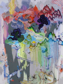 |
| Cloud Map p1414, 2014 |
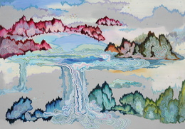 |
| Cloud Map p1315r, 2013 |
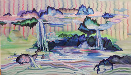 |
| Cloud Map p1317, 2013 |
Friday, November 06, 2015
Giovanni Morales

Morales is a Las Vegas painter who takes inspiration from comics and creates layers of different styles on top of one another.
Morales' work is really interesting to me, and reminds me of Roy Lichtenstein. I love how distressed the comics look, and wonder if some of the imagery is from real comics. I also like the vintage look of the text. I would like to see a different kind of scene that may not be a close up portrait, but a full scene.
I would like to learn how was able to achieve the faded distress look, to see multiple layers, because I would like to try to make my imagery distressed and faded as if it were older.
 |
| Caught in a Fantasy |
 |
| Wolf in Sheep's Clothing |
 |
| Desire |
Sunday, November 01, 2015
Oriol Angrill Jorda
Jorda's Website
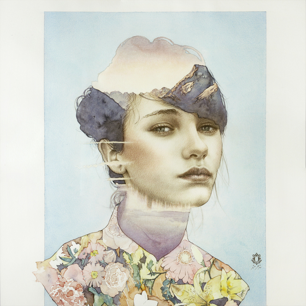
Most of Jorda's art is drawing, and watercolor. He depicts blended imagery of portraiture and nature landscape. overlapping in a silhouette of the portrait. He also does printmaking of the various kinds, but mostly limited to the same image in various depictions.
I like his work with blending portraiture and nature. I find his watercolor to be very beautiful in how detailed he makes it, (he also makes video of himself painting). I do wish he would step away from the rainbow color portraits because I find them more gimmick, and would have had a better impact and as a single color, not necessarily black.
I would like to use his method of applying watercolor, since he has videos out I could use for myself, I enjoy the concept of being able to do free hand painting, no under drawing, with watercolor paints in particular.
Most of Jorda's art is drawing, and watercolor. He depicts blended imagery of portraiture and nature landscape. overlapping in a silhouette of the portrait. He also does printmaking of the various kinds, but mostly limited to the same image in various depictions.
I like his work with blending portraiture and nature. I find his watercolor to be very beautiful in how detailed he makes it, (he also makes video of himself painting). I do wish he would step away from the rainbow color portraits because I find them more gimmick, and would have had a better impact and as a single color, not necessarily black.
I would like to use his method of applying watercolor, since he has videos out I could use for myself, I enjoy the concept of being able to do free hand painting, no under drawing, with watercolor paints in particular.
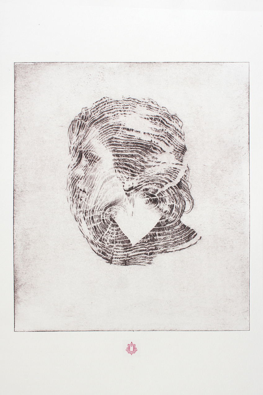 |
| Woodline |
 |
| Oukaly Watercolor |
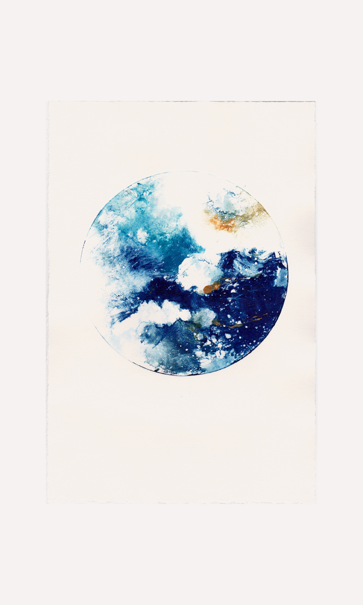 |
| Monoprint II, 2014 |
Monday, October 26, 2015
Bertrand Flachot

Bertrand is a photographer and enlarging his images to draw over in various materials. It has been described that his work is to create the second attempt of the scene, what it was and what it is now, overlapping his line work over the previous image.
I like Bertrand's art, that he has various line weights and seems to have a sense of control in his drawing, not some random squiggling.
I find my favorite scenes of his is when the landscape imagery tend to disappear into the white walls, that he is able to create a natural transition. I also find it interesting that many other images are on a black background and draws with various colors.
If I were to take something from Bertrand it would be his line weight in his drawings, in many of my sketches, I tend to scribble out my composition, and I think it would be interesting to have layers of an image, from my scribbles to a final composition.
 |
| Fil Conducteur (Thread) |
 |
| Constellation #5 Phase 1 |
 |
| Ligne de Flottaison(Just above the Waterline) |
Monday, October 19, 2015
Quote Response
KIKI SMITH
“I think making things beautiful is important. But often what’s first considered ugly is beautiful, too.”
I really like this quote because I like looking at old objects and old buildings, things left for time, and for nature to overtake. I do not really find much unappealing, and I do find it important to find beautiful things in the not so, because I see it reflect in how people perceive situations, that it would be finding a silver lining in despair.
This came about for me when my favorite book/cartoon series W.I.T.C.H, by adjfk, had a main character that was an artist, Hay Lin and in an episode called Xanadu, meaning idyllic, exotic, luxurious, place of contentment, she created a dystopian image, and her xanadu came from a glowing god-like imagery of hope will come.
I have a desire to make odd and old things look more beautiful, to an average person.
Sunday, October 18, 2015
Midterm Review: Self evaluation
Reviewing myself, I find that I am doing ok in class.
For the Blog I think I do decent post once a week, and answer the weekly posts well. If anything had to change it would to either be more in depth or do an extra post a week to compensate.
The two quick pieces at the beginning of the semester was fun, and may become something I explore more in the future.
For the new technique/material test, I had enjoyed the texture I could get, and how the watercolor looked different on the spackle versus on the paper.
For the main work in class, with the large 3-panel comic and comic cover, I know I work really slow, because of both planning, and application, and I have a desire to try to work somewhat large, and perhaps in a later project I can do multiple small projects. I can most probably say that in part it is that I am taking 5 art classes at the same time.
For the Blog I think I do decent post once a week, and answer the weekly posts well. If anything had to change it would to either be more in depth or do an extra post a week to compensate.
The two quick pieces at the beginning of the semester was fun, and may become something I explore more in the future.
For the new technique/material test, I had enjoyed the texture I could get, and how the watercolor looked different on the spackle versus on the paper.
For the main work in class, with the large 3-panel comic and comic cover, I know I work really slow, because of both planning, and application, and I have a desire to try to work somewhat large, and perhaps in a later project I can do multiple small projects. I can most probably say that in part it is that I am taking 5 art classes at the same time.
Saturday, October 17, 2015
No Constraints or Restrictions: Mini Mt. Fuji

The purpose of creating a fake Mt. Fuji, would be to bring an iconic landscape overseas, and could work with other landscapes. To make it as giant as it is, would so people can linger and sit and enjoy the space.
The installation will have 17 layers, each 6 inches tall, so the overall will be 102 inches or 8 1/2 feet in height. The bottom 12 layers would be made of Bardiglio Grigio, stone with a blue tint, while the top 5 layers will be Statuario Venato, a white stone, for the snow covered top.
Since it is too expensive to have the entirety of the project be stone, I would fill the centers with cement and mulch.
On top of the installation would be a cherry blossom, planted at an angle, so when it blooms it looks like pink smoke coming out and carried in the wind. Thus needing the dirt, only guessing how much dirt is needed for a tree, about 5 feet in depth and 7 feet wide, about 35 square feet.
The concrete would be also hard to estimate without an exact size. Following an equation for a volume of a pyramid, (LWH/3=V), 70x65x8/3=12,133.33 square feet. A max estimate as the topographic map of Mt. Fuji is not an exact pyramid and would require less concrete.
The most difficult part of this project is finding a supplier and estimating a price.
Friday, October 09, 2015
Caia Koopman

I like Koopman's color choices, to do pop bright colors to toned downed, and designs of her characters, and the repeated designs of birds and flowers in many of her images. If I could change anything, it would be to have multiple figures in a composition and not one alone.
If I were to take something from Koopman's work it would be her stylized human figure, because they have an attractive sultry look to them.
 |
| Miss Pink |
 |
| Where are all the Bees |
 |
| Liberty and Blaze |
Thursday, October 08, 2015
Installation Idea
If I had to create an installation, I would like to have an entire room.
On the walls would be a landscape of a dystopian future, old abandoned cities In the distance. The main color palette would be various shades of brown and light blue to grey. In some areas have nature overcoming the man made.
In the room itself would hold a run down hut house made of wood with sheets of metal for the ceiling and a piece of cloth hanging off the top that was to protect the inside of an unfinished building, as you see today.
Scattered about would be wooden boxes. On each box would have a character, and each side would be the same character in the same pose but as seen from the front, back, the sides, and top and bottom. The size of the box would fit the pose of the character or how much space they need, such as a person jumping would have a vertical space.
Finally spread across the room would be hangings of related imagery of the characters, paintings and drawings etc.
Friday, October 02, 2015
Alphonse Mucha
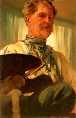
I like the delicate look he has given his imagery
If Mucha had to change anything it would be, to do more sculpture, the few that I saw were beautiful, and I think he could improve upon the framing of the imagery, because some appears to match better then others.
I would like to take his stylistic approach to the figure, with the thick outline, and the flat smooth color he achieved to create skin.
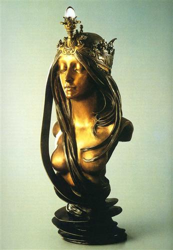 |
| Nature |
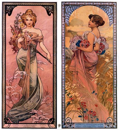 |
| The Season (Spring, Summer), 1898 |
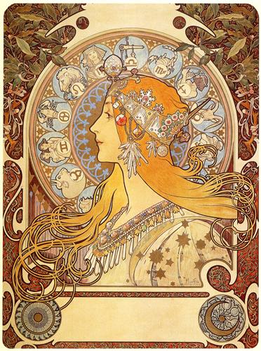 |
| Zodiac, 1896 |
Monday, September 28, 2015
Aspects to take for myself
Katsushika Hokusai
I love his line work and the simplicity of many areas in his images. Whole areas of his images are suggested through a single line, much like the sky is. I also find that his line work brings the large areas of flat colors to life, and the few colors he used to achieve that image.
,_De_grote_golf_bij_Kanegawa_(1829-33).jpg)
James Jean
I love his drawing style and color choices, as he was recently introduced to me from a friend and I recognize the style from the comic books. I like how much detail comes through with a few lines, and even in an absence of a background, I still sense they are in the woods. The colors he chooses also seem to be made for the image, as most appears to be limited to about 2 or 3 colors. I also find amazing how clean his color is, in that I can barely tell what he used to create it, but is smooth and gradual, with touches of light and shading.

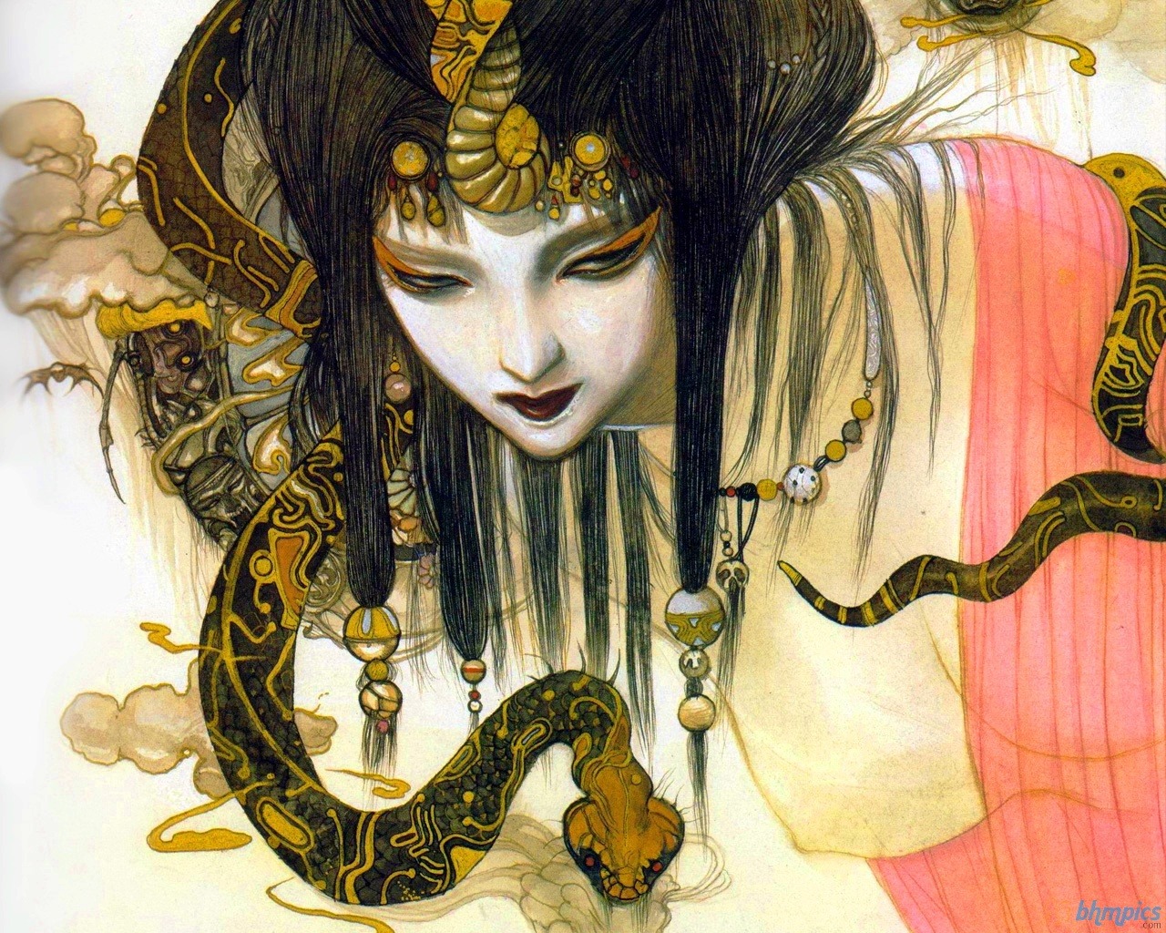
Yoshitaka Amano
I love her style overall, in particualar I like how she changes focus in areas, leaving some areas left uncomplete, and the atmosphere I feel from some of the imagery is what I similarly desire in my images. The detail she achieves in her work, and the designs I would like to see in my own work, and so learning when to stop or keep working would be a good skill.

Compositions
Last year in my art history classes, the teachers had brought that many take compositions for themselves. It had came to thought that I could go through old master images and have similar placements of my own images. There is no particular artist I would look into but most likely would start at the Big 4 and the go around, because I know aspects of art was studied and developed during the renaissance, and creating a dynamic composition would be one.
I love his line work and the simplicity of many areas in his images. Whole areas of his images are suggested through a single line, much like the sky is. I also find that his line work brings the large areas of flat colors to life, and the few colors he used to achieve that image.
James Jean
I love his drawing style and color choices, as he was recently introduced to me from a friend and I recognize the style from the comic books. I like how much detail comes through with a few lines, and even in an absence of a background, I still sense they are in the woods. The colors he chooses also seem to be made for the image, as most appears to be limited to about 2 or 3 colors. I also find amazing how clean his color is, in that I can barely tell what he used to create it, but is smooth and gradual, with touches of light and shading.
Yoshitaka Amano
I love her style overall, in particualar I like how she changes focus in areas, leaving some areas left uncomplete, and the atmosphere I feel from some of the imagery is what I similarly desire in my images. The detail she achieves in her work, and the designs I would like to see in my own work, and so learning when to stop or keep working would be a good skill.
Compositions
Last year in my art history classes, the teachers had brought that many take compositions for themselves. It had came to thought that I could go through old master images and have similar placements of my own images. There is no particular artist I would look into but most likely would start at the Big 4 and the go around, because I know aspects of art was studied and developed during the renaissance, and creating a dynamic composition would be one.
Friday, September 25, 2015
Charlotte Caron
I love that she has such a variety of work, from 2D to 3D, but mostly considered to be a photographer and a painter.
I like that Caron has abstraction in most of her works, and takes similar imagery into the various art styles, that she has imagery that she works from. I also enjoy that her photos are used for the animal paintings, but I also wished she got into doing something other then portraits alone, like tails.
I would like to take away her ability to blend realism or a image into a blended smeared look. I feel that if I could do that, without to much or too little,I can feel more successful and improving my abstract work.
I like that Caron has abstraction in most of her works, and takes similar imagery into the various art styles, that she has imagery that she works from. I also enjoy that her photos are used for the animal paintings, but I also wished she got into doing something other then portraits alone, like tails.
I would like to take away her ability to blend realism or a image into a blended smeared look. I feel that if I could do that, without to much or too little,I can feel more successful and improving my abstract work.
 |
| ECUREUIL / SQUIRELL |
 |
| TRIPTYQUE / TRIPTYCH |
 |
| 3 GARDEN / GARDEN 3 |
Sunday, September 20, 2015
Impressed
 |
| Water Lilies, 1914 - 1926 Each 6' 6 3/4" x 13' 11 1/4", Overall 6' 6 3/4" x 41' 10 3/8" |
A quote from the MoMA website
The aim of his large Water Lilies paintings, Monet said, was to supply "the illusion of an endless whole, of water without horizon or bank." ... his water-lily pond, and the sky above are the subjects of this monumental triptych, his representation of them can be seen to verge toward abstraction....In his enveloping, large-scale canvases Monet sought to create "the refuge of a peaceful meditation in the center of a flowering aquarium."Other qualities that I think can make artwork impressive are there uniqueness, to be able create imagery and technique unique to the artist, and if the image can talk for itself, that the image can stand alone, with out explanations, or other pieces.
Friday, September 18, 2015
Helene Schjerfbeck
 |
| July 10, 1862 - January 23, 1946 |
Helene is known as a portrait painter, painting in realism and eventually into expressionism.
I like Helene's transition from realism to expression, and that you can see it her paintings. I like her choice to do portraits of young girls, as a female painter. Her early portraits look very delicate and soft and only become flatter in a sense because they do not lose the soft touch just approached in a different way.
From Helene work I would aspire to record my transitions in art over time. I also would love to learn how she had rendered the hair in her portraits.
 |
| Smiling Girl, 1921 |
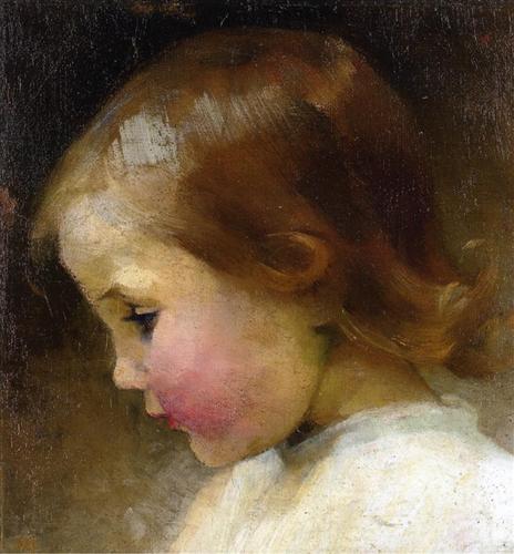 |
| Portrait of a Girl, 1887 |
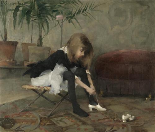 |
| Dancing Shoes, 1882 |
Friday, September 11, 2015
Gabriel Moreno
 Moreno is an illustrator, known to make advertisements with his imagery.
What i like about his art is that he creates beautiful realistic portraits, and adds a splash of color, adding to the space, and drawing attention.
I take away that color can be used sparingly, and can still be vibrant and stand out among an image, nor does it have to collaborate with the imagery, but accent it.
 |
| Guardian |
 |
| Peacock III |
 |
| Pavoreal |
Saturday, September 05, 2015
Hebru Brantley

Hebru Brantley is painter with a comic style and theme.
I’m a huge fan of mythology, and the biggest form of that now is through comics. Within my culture, we don’t really have a true mythology, but [this series] is spinning that, presupposing that if these characters were people of color, how they’d fit into that mythos. As a showpiece, in making these characters people of color, it changes the lore and the mythology of everything.
I would like to adapt his free ability to overlap and layer imagery, to make a complete composition versus to every little thing in the image is to be perfect.
 |
| Advertisement #59 |
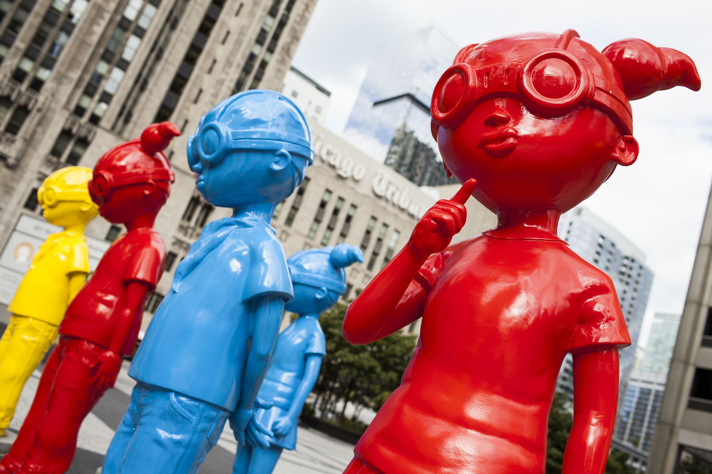 |
| The Watch |
 |
| Hollywood Villain |
Gustave Moreau

April 6, 1826 - April 18, 1898
Moreau is known to be an artist that has a focus on biblical and mythological themes.
What I like about Moreau's art is that he puts detail into every part of the painting, but with adjustments to the focus, some focused, other areas blurred.
What I can take from his work is the detail he puts into his images, if I section off areas in my unfinished paintings, the finished areas would have plenty of detail.
|
| April 6, 1826 - April 18, 1898 |
What I like about Moreau's art is that he puts detail into every part of the painting, but with adjustments to the focus, some focused, other areas blurred.
 |
| Salome Dancing before Herod, 1876 |
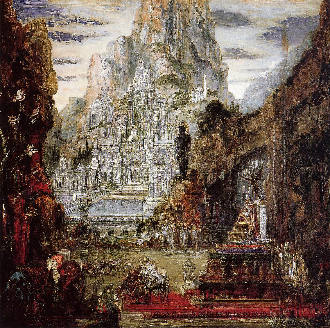 |
| The Triumph of Alexander the Great, 1886-1892 |
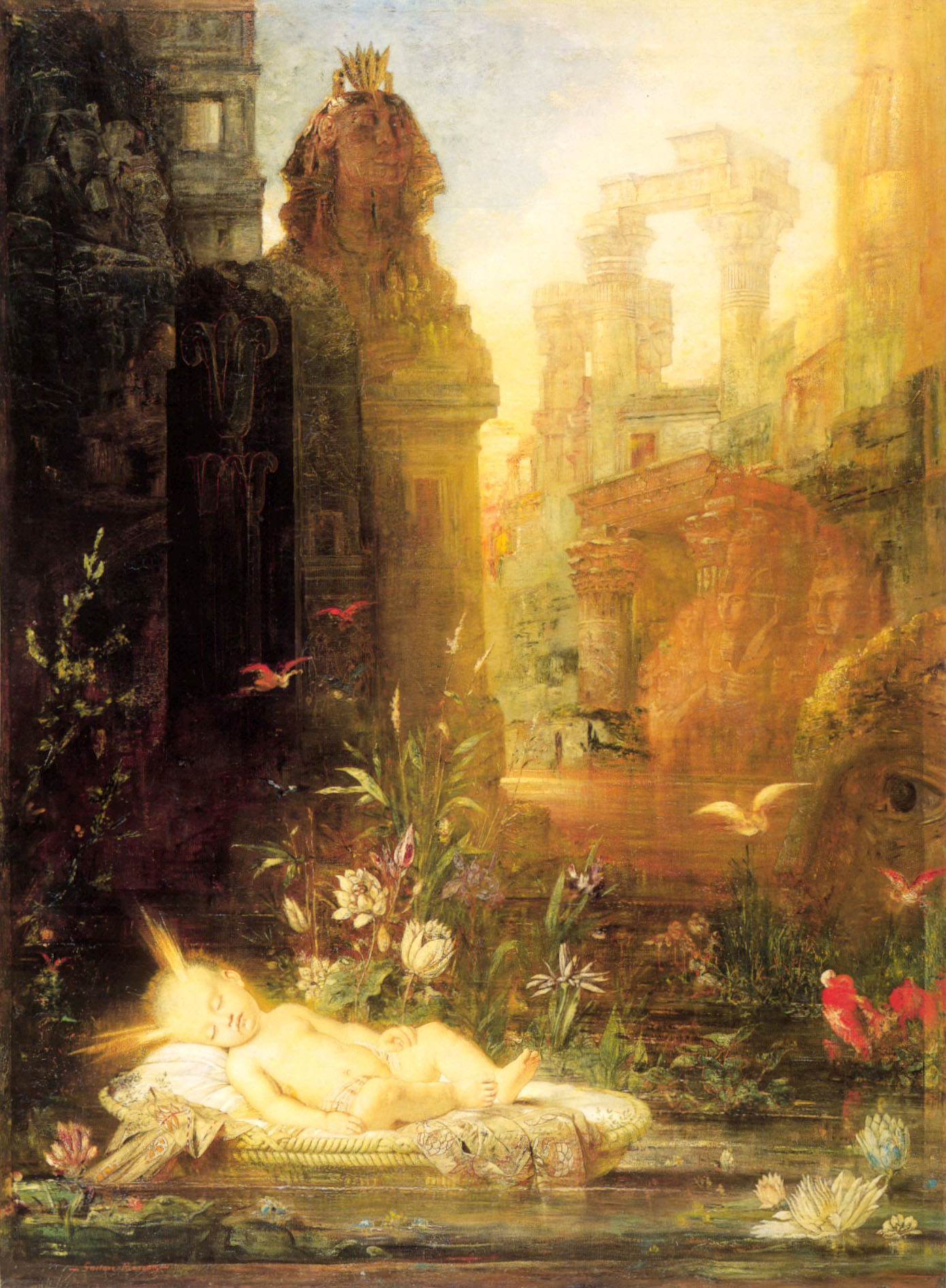 |
| Young Moses |
Subscribe to:
Posts (Atom)